
Mission to Mars – getting closer to being populated
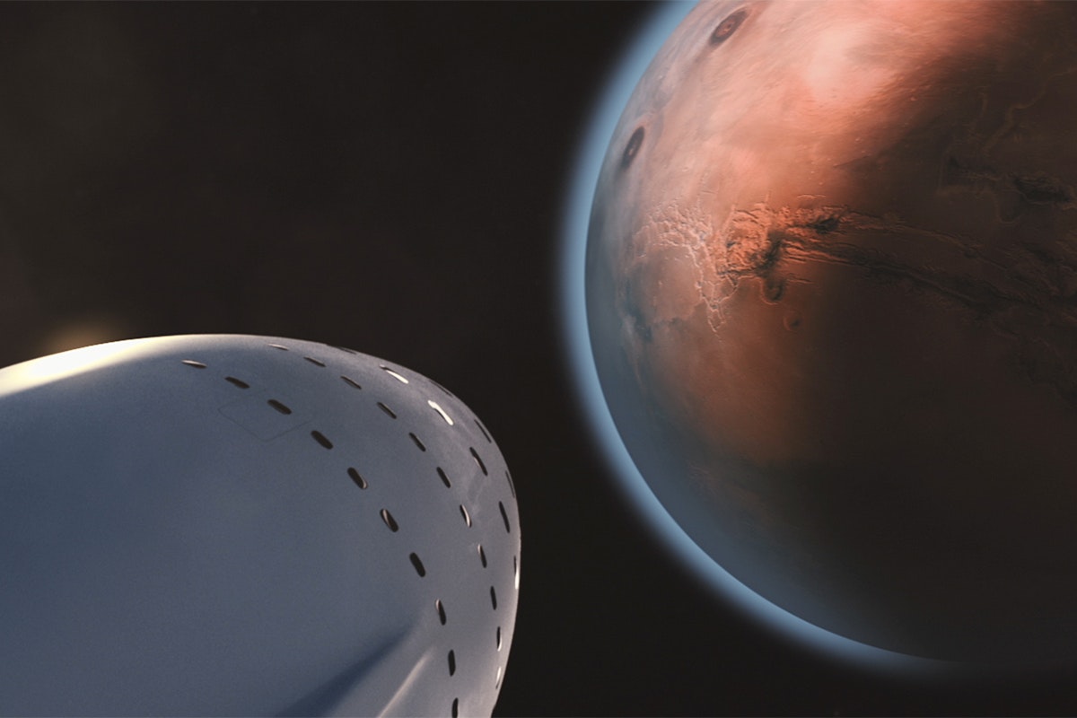
The prospects of colonizing Mars have long captivated human imagination – and it’s no idle fantasy. For centuries, astronomers, engineers, and scientists have been devising ways to make human settlement on the Red Planet a reality. Today, thanks to rapid advancements in space exploration technology and increasing global interest in exploiting and occupying the solar […]
Read More »


